Case studies
AREA
B2B Services
Brand, sales and go-to-market
Context
Are business services sold to organisations or the people within them?
The representational standards that were once reserved for consumer brands and startups are spilling over into traditional enterprise categories. B2B providers, from producers of high-tech to professional services, face increasing pressure to prove added value and differentiated expertise to defend their margins, attract new clients and retain existing one’s. Often underserved by traditional agencies and fearing that potential providers will not fully grasp the intricacies of their category, B2B brands need partners that are able to connect creativity with business-mindedness and deliver pragmatic solutions.

Experience
Advising B2B services providers in finding new value, clients and markets
We have helped numerous international business-to-business clients to redefine their value proposition, sales strategy and scale international growth. Our approach of connecting brand and sales efforts is perfectly positioned for organisations looking to translate their business ambition into solutions that generate real value. Since 2016, we have collected a broad range of experience in the space, which helps us take-on complex projects spanning over different countries and organisational functions.
COMPONENTS
- Brand strategy, go-to-market strategy, identity design, sales strategy, sales materials
Venipak
Building trust to represent client brands
The client approached us with a challenge to refine their positioning in the region and to define the values they deliver to their B2B clients. We conducted client interviews with the goal of identifying key delivery partner strengths and real benefits that make a difference and directly impact client's organization. What guided us towards the result was the discovery that in the eyes of parcel receivers, delivery services are seen as an extension of the brands they are ordering from. Therefore, when striving for excellence, the delivery partner must focus on how they represent their clients. Following these insights, we crafted the central brand promise "To deliver on behalf of your business". The key focus was put on representation quality, efficiency, and collaboration – the principles that encouraged product, sales and marketing teams to think on how to minimize clients' efforts.

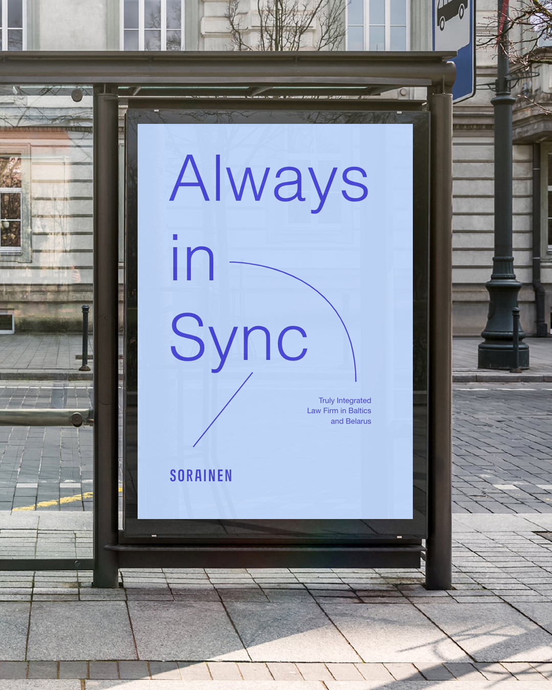
Sorainen
Uniting the region’s leading legal brand across borders and disciplines
The client approached us with the need to refine their positioning across the highly competitive market of 5 regions. Looking at competitive landscape, we found one core value that stood true solely for our client. It was the only law firm that truly collaborated across regional offices and different disciplines. On the service level, the firm connected knowledge and experience, supported and enhanced clients by forming international and inter-discipline teams to connect solutions to business outcomes. Meanwhile, on the employer branding level, the firm was offering carriers without borders. This led us to building their brand around the key concept of “The most connected law firm”.

INHUS
Strengthening position in export markets
The client was strengthening their export efforts and needed an updated proposition that would reflect the added values they bring to the Scandinavian markets. By analyzing the interplay of different parties and stakeholders within a construction project as well as the general competitive context, we crafted the proposition bringing simplicity to design-build delivery. It focused on the benefits of reducing the number of coordination and hand-off points, as well as improved risk management within a construction project. After successful INHUS export expansion we continued to work on the same proposition and strengthen it by aligning other external and internal communication touchpoints around it. The project expanded into full organizational OS (operating system) development with internally focused projects.

NFQ
Putting teams at the spotlight of the client's employer brand
With many industries rapidly digitalizing all at once, the supply of talent could not keep up, leaving our client in greater need to prove they can offer a meaningfully different career experience. Talking with the industry top talents, we discovered that they were choosing their career destinations based not so much on an organization, but rather on a specific team and its lead. Therefore, our communication goal was to show the ways in which each team at NFQ is unique, special and inviting potential candidates to *make their own way*. This led to us focusing on individual teams, not the company. “Team’s way” was a campaign where each team got the spotlight in social channels for a couple of weeks to present their ways of working, ways of delivering value and solving problems. It created an opportunity for candidates to get to know a particular team before joining the company.

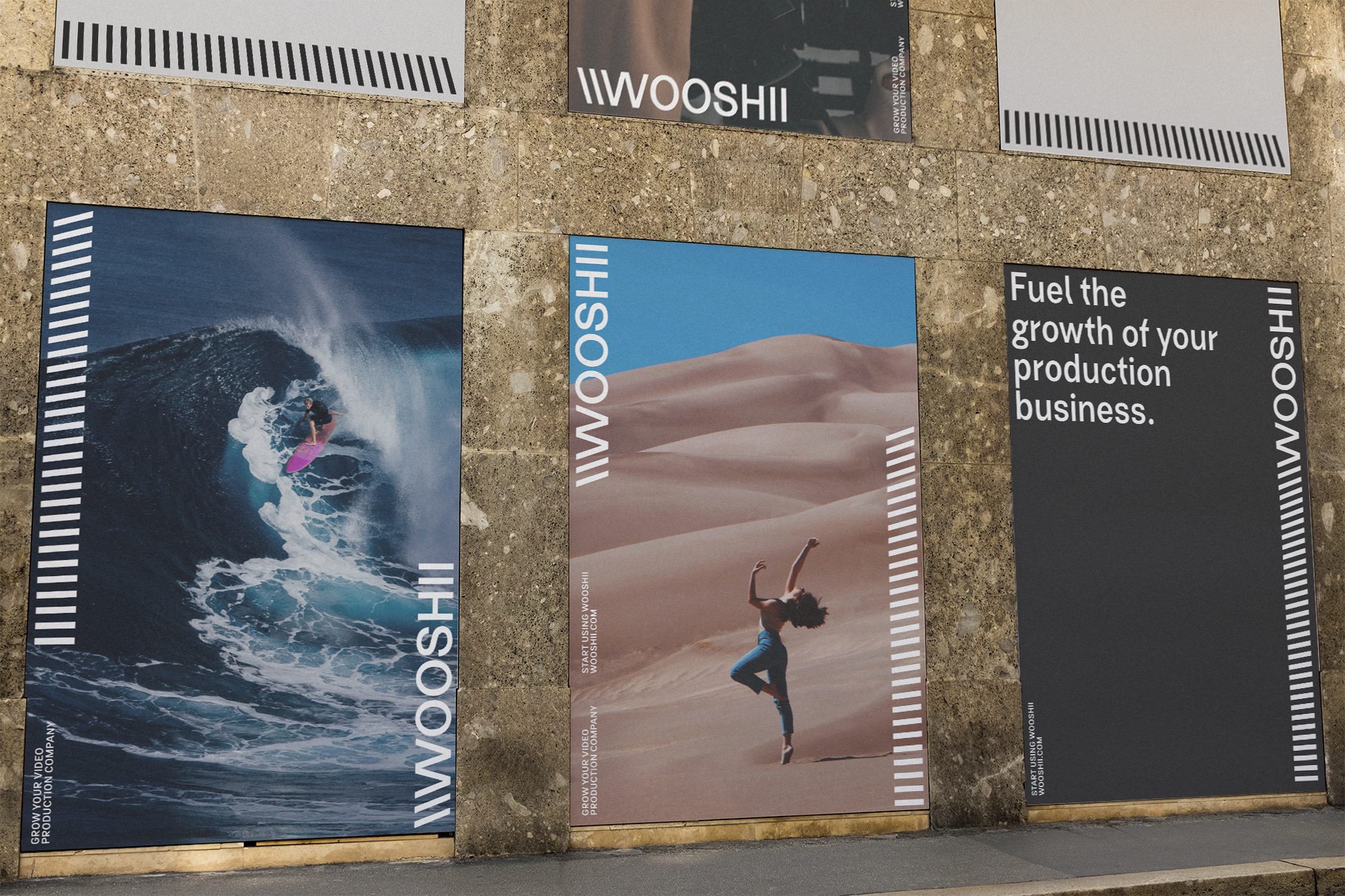
Wooshii
Identity for global video production service
The client approached us with a task to translate their creative approach into brand identity; thus, with the visual identity for Wooshii at its core, we created a graphic system for recognizing the brand from a distinctive visual element and for communicating their professional and bold approach. The whole identity system is based on Wooshii’s expertise, striving for innovation, technological reliability and mission to provide an all-in-one solution for companies, making video production quicker, frictionless, flexible and exciting. The word ‘Wooshii’ has a distinctive rhythm which is formed from letters ‘O’ and ‘I’ as they repeat themselves and create a slight shifting between the symbols. Meanwhile the key element derives from Wooshii’s logo and showcases the process of transformation from static to dynamic. With its repetitive pattern it emulates the rhythm of the logotype and can be easily adapted to any format without disruption, yet maintaining their unique identity.


"Working closely with Synthesis strategists is always a great experience if you are a client – they are able to quickly deconstruct ideas and guide you through your implementation journey, suggesting actionable insights for you to use on the way. The long term partnership with Synthesis Consulting Group has helped our company capture tremendous value."
Vilius Česnauskas
COO, NFQ


